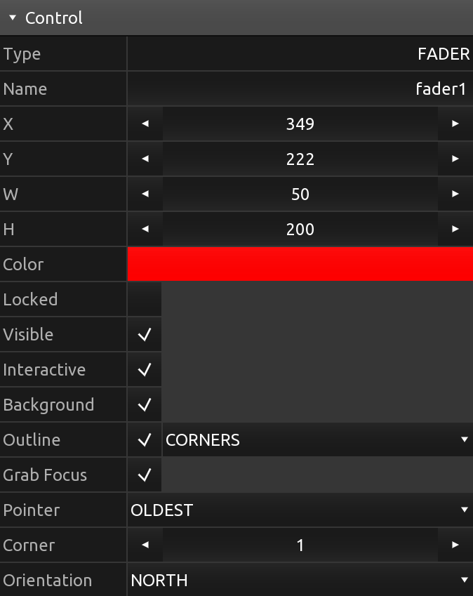
Editor · Control · Properties
All controls have properties that determine appearance and behaviour.
Control properties can be changed in the editor and by messages and scripts.
All controls have a set of common properties and another set of properties specific to their type. Not all control types might use all the common properties or use them in the same way.
For a list of control type specific properties, see the control reference.
- Type
- Name
- Tag
- X, Y, W, H
- Color
- Locked
- Visible
- Interactive
- Background
- Outline
- Grab Focus
- Pointer
- Corner
- Orientation
Type
The type of the control.
See the control reference for all possible types of controls.
Name
The name of the control.
A name string can be freely assigned to a control and does not have to be unique. Use this property to identify controls in messages or scripts.
Tag
A tag for the control.
A tag string can be freely assigned to a control and does not have to be unique. Use this property to identify controls in messages or scripts.
X, Y, W, H
The x and y position and the width and height of the control.
Note: All are integer values.
Color
The color of the control.
Depending on the type of control, this property will be used as a base color from which multiple shades will be generated for different parts of the control.
Locked
The locked state of the control.
When a control is locked, it cannot be selected or otherwise modified in the editor. To unlock a control, right-click (or long-press on mobile) and select Unlock from the context menu.
Visible
The visible state of the control.
If the visible property is set to off, apart from the control not being rendered, it will also not be considered as the target for any pointer interaction, same as if the Interactive property was set to off.
When a control is not visible, it can still be selected in the editor, either directly or by lasso selection, to change the visibility back to on.
Note: The list of pointers currently associated with the control will not be modified when this property changes.
Interactive
The interactive state of the control.
This property determines if the control will be considered when picking the target of a pointer interaction.
Note: The list of pointers currently associated with the control will not be modified when this property changes.
Background
Determines if the control should be rendered with a background.
Outline
Determines if the control should be rendered with an outline and which style of outline.
Possible outline styles are:
- FULL
- CORNERS
- EDGES
Grab Focus
Determines if the control will capture pointers that are interacting with it.
If this property is set to off, a pointer will only be associated with the control for as long as the pointer's position is within the frame of the control and no other control has captured it.
If this property is set to on, the pointer will be added to the list of the control's pointers when it first enters the control's frame, and only be removed when the pointer event ends.
Pointer
Determines which pointer takes priority if there's multiple pointers interacting with the control.
Most types of controls only need one pointer input to determine their behavior, for example a button or a fader-like control. If multiple pointers are associated with the control, this property will determine which of the pointers will be selected as the most significant one - the one that will be used when updating the control's state and values.
Possible values are:
- OLDEST
- NEWEST
Corner
Determines the amount of corner rounding the control will be rendered with.
A value in the range from 0 to 10, with zero indicating no rounded corners.
Orientation
Determines the orientation of the control, which will influence the control's rendering and behavior depending on control type.